From Editorial Composition to Publication System
From Editorial Composition to Publication System
How a visual experiment about editorial design evolved into a responsive, accessible, development-ready system for stories, journeys, and services.
This project began with a single editorial composition.
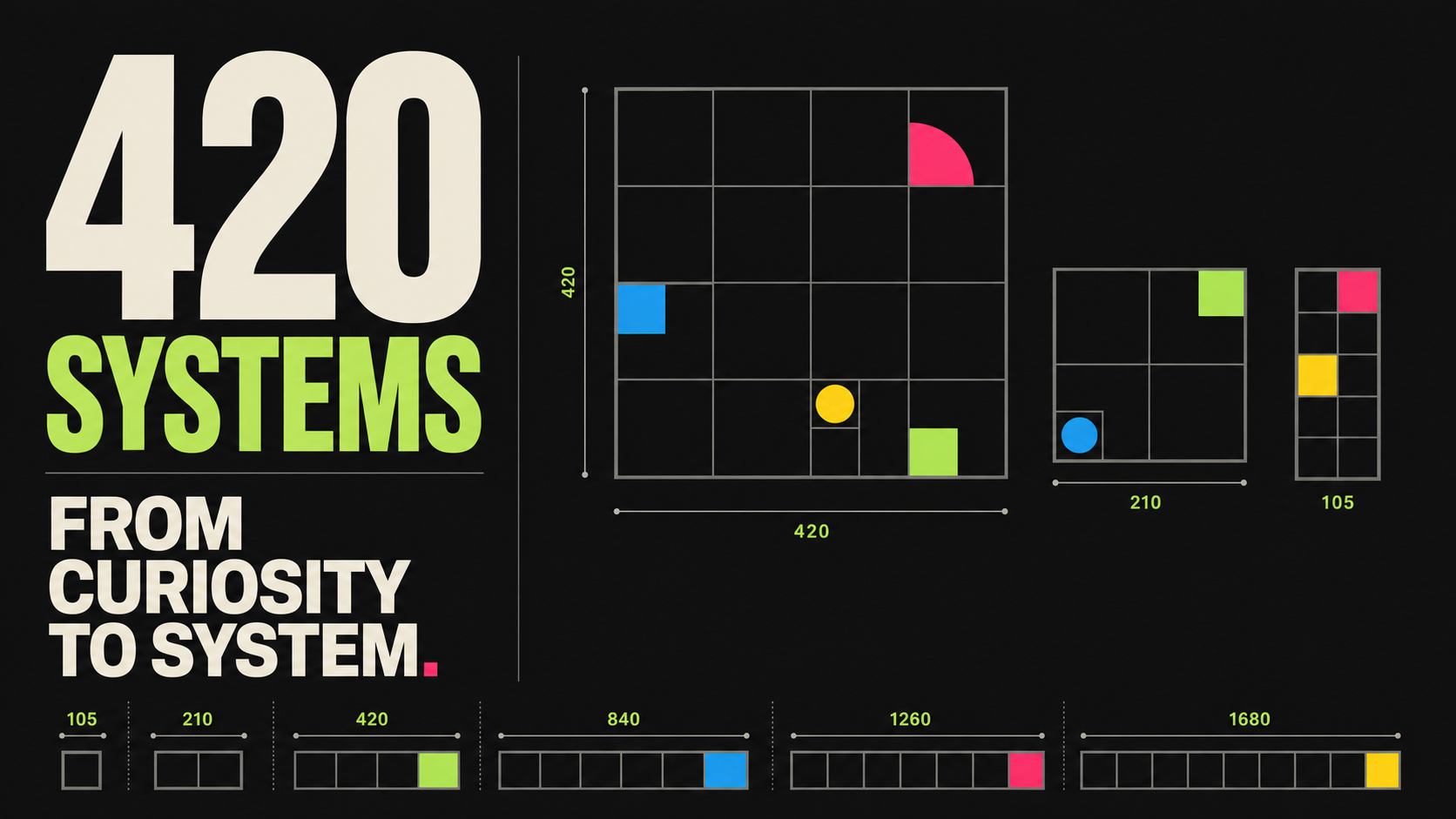
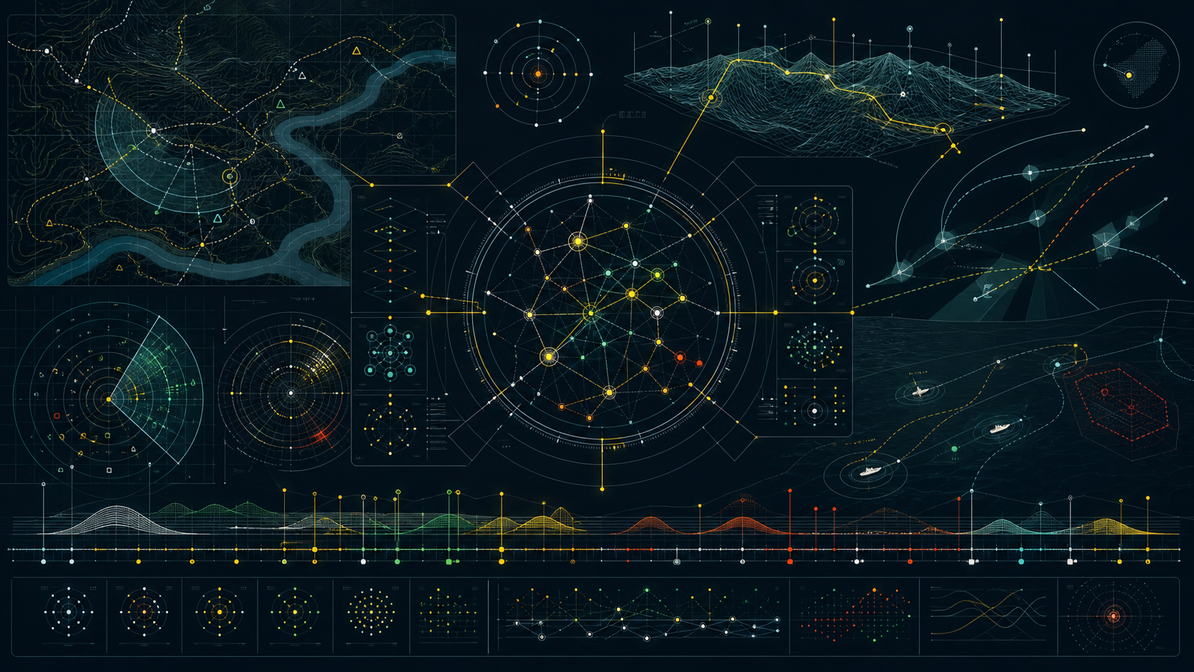
The original specimen was deliberately expressive: oversized typography, a dark field, electric blue accents, fine rules, and organic imagery moving behind a rigid grid. It was designed to communicate something about editorial design while enacting the idea itself.
It looked like a page with a point of view.
But one attractive page is not a system. The real question was whether that visual language could survive an actual publication: long stories, unpredictable photographs, practical travel information, responsive layouts, interactive media, forms, transactions, accessibility requirements, and constantly changing content.
That question transformed the project.
Content came before components
Instead of beginning with a conventional inventory of buttons, fields, and cards, we began writing.
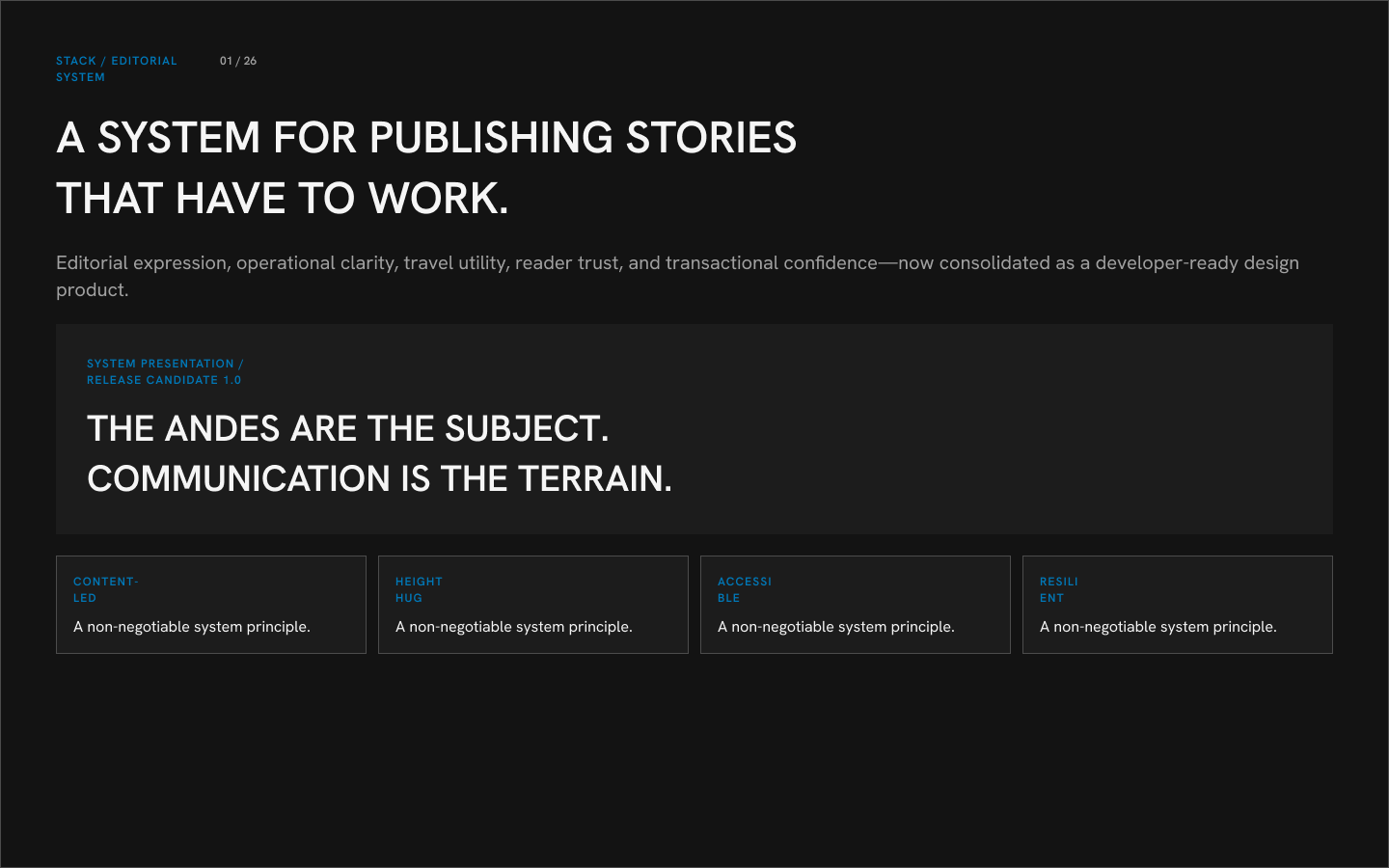
The first major specimen was a story about climbing in the Andes, told from a hiker’s perspective. The article introduced long-form reading, multiple sections, photographs, captions, pull quotes, data, route information, and an author profile.
The content immediately exposed requirements that an abstract component exercise would have missed.
Body copy needed a comfortable reading size and measure. Subheads needed enough presence to organize a long page. Images needed to establish place, reveal scale, explain conditions, and occasionally add warmth—a photograph of a llama proved unexpectedly valuable for that last role.
Most importantly, the layout needed to respond to the content rather than merely contain it.
Height Hug became an editorial principle
One recurring problem was deceptively simple: text containers were not always adapting to their content.
A composition could look correct with one paragraph and fail as soon as the title wrapped, a caption became longer, or an editor added another sentence. Fixed heights produced clipping, accidental whitespace, and manual repair work.
Auto Layout and Height Hug therefore became more than production settings. They became editorial contracts.
The complete text unit receives Auto Layout. Its text and wrapper grow vertically with the content. Section labels fill the available container. Fixed dimensions are reserved for elements whose geometry must remain controlled, such as media ratios, icons, touch targets, and specific controls.
This allows typography to govern the composition. Content can change without quietly destroying the layout around it.
The same principle was applied retroactively across the library and tested at 320, 390, 768, and 1440 pixels.
Photography introduced tempo
As more Andes photography entered the system, the library needed to support more than a hero image followed by text.
We developed patterns for single images, portraits, landscapes, full-bleed moments, captioned figures, close groupings, mosaics, photo arrays, and swipeable galleries. Video introduced another layer: play states, responsive controls, transcripts, keyboard behavior, mobile density, and reduced-motion alternatives.
The important question was not simply how many images a pattern could hold. It was what each image was doing for the story.
Some images establish geography. Some reveal scale. Some provide evidence. Some slow the reader down. Others provide a transition between dense sections of text.
The resulting media system treats placement as an editorial decision—not decoration.
A publication must also help people act
The Andes story naturally expanded into trip preparation.
Readers needed equipment lists, camp stages, altitude information, route maps, weather context, emergency guidance, downloadable documents, and local services. That pushed the system beyond reading and into practical utility.
Maps gained topographic treatments and route overlays. Data appeared in tables and altitude profiles. Announcements communicated changing road or weather conditions. Resource cards provided preparation packs, maps, checklists, and offline documents.
From there, the pattern library continued into search, navigation, forms, registration, checkout, payments, confirmations, saved trips, account access, cancellations, refunds, receipts, support, and correspondence.
This was a meaningful shift. The system was no longer responsible only for presenting a story. It needed to preserve trust across the entire relationship with a traveler—from the first paragraph to a failed payment or changed itinerary.
Hardening changed the nature of the work
As the library grew, the work moved from composition to resilience.
Components were tested with long titles, missing images, dense prose, empty states, dynamic data, localization, and narrow screens. Interactive elements gained hover, focus, active, disabled, loading, success, and error states.
Accessibility moved into the structure of the system: visible keyboard focus, contrast requirements, semantic annotations, document alternatives, transcripts, reduced-motion behavior, and content guidance that does not rely on color alone.
Each failure followed the same repair pattern:
Observe the failure → repair the source → propagate the fix → document the contract.
This distinction matters. Fixing a specimen creates a better screenshot. Fixing the source makes the entire system more reliable.
The finished system has four connected layers
The system now operates across four levels.
Foundations
Semantic color, typography, spacing, radius, elevation, motion, responsive behavior, and content constraints.
Components
Buttons, fields, navigation, icons, cards, announcements, media controls, tables, commerce elements, and their states.
Patterns
Editorial sections, galleries, maps, route data, local services, forms, transactions, accounts, and communications.
Journeys
Long-form reading, departure planning, registration and checkout, account recovery, and ongoing communication.
Decisions flow downward through these layers, while evidence flows upward. A token is not proven because it exists. A component is not complete because it has variants. The system is proven when real journeys remain coherent across content, interaction, accessibility, and responsive states.
What stayed constant
The project changed dramatically, but its original values remained intact.
The typography is still confident. The visual system remains restrained. Photography still carries narrative weight. Blue still signals purposeful action and structure. The publication still feels editorial rather than generically “productized.”
What matured was everything required to preserve that character under pressure: responsive behavior, content resilience, reusable states, accessibility, commerce, governance, testing, and developer handoff.
The library currently contains 99 component sets, 1,275 component sources, 1,907 live instances, 47 semantic variables, four system modes, and 51 numbered specimens. Those numbers demonstrate scope, but they are not the value of the system.
The value is continuity of intent.
A reader should feel the same clarity in an essay, a gallery, a route table, a checkout form, and a cancellation notice. An editor should be able to change content without rebuilding the page. A designer should be able to compose without repeatedly solving foundational problems. A developer should be able to understand not only what a component looks like, but how it is expected to behave.
That is the evolution this project documents: from an editorial composition into a publication system—and from a collection of attractive parts into a shared language for making, operating, and trusting a complete digital publication.
Explore the system

image - hero
No marks yet.